# CSS 动画案例
在上一章介绍完animation的各个属性以后,我们来看一些网页中常用的动画效果巩固一下。
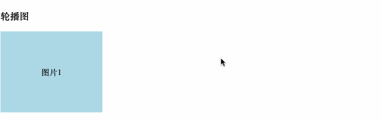
# 轮播图
在实现之前我们先分析一下,轮播图肯定是循环播放几张图片,那么这几张图片要排成一行,放进一个容器里。这个容器的大小应该等于一张图片的大小,然后这一排图片按照从右到左的顺序移动,就形成了轮播图。鼠标移动到图片上,动画停止,用户可以看到具体的图片信息。好了,我们直接来看代码实现:
<!DOCTYPE html>
<html lang="en">
<head>
  <meta charset="UTF-8">
  <meta name="viewport" content="width=device-width, initial-scale=1.0">
  <title>CSS Animation的几个例子</title>
  <style>
    .box-1{
      height: 160px;
      width: 200px;
      overflow: hidden;
    }
    .pic-box{
      height: 160px;
      width: 800px;
      background-color: grey;
      display: flex;
      animation: slide 8s 1s alternate infinite linear;
    }
    .pic-box:hover{
      animation-play-state: paused;
    }
    .pic-box div{
      height: 160px;
      width: 200px;
      /* 让文字居中 */
      display: flex;
      justify-content: center;
      align-items: center;
    }

    @keyframes slide{
      0%, 10%{
        transform: translateX(0);
      }
      30%, 40%{
        transform: translateX(-200px);
      }
      60%, 70%{
        transform: translateX(-400px);
      }
      90%, 100%{
        transform: translateX(-600px);
      }
    }

  </style>
</head>
<body>
  <h3>轮播图</h3>
  <section class="box-1">
    <section class="pic-box">
      <div style="background-color: lightblue;">图片1</div>
      <div style="background-color: lightcoral;">图片2</div>
      <div style="background-color: lightgreen;">图片3</div>
      <div style="background-color: lightsalmon">图片4</div>
    </section>
  </section>
</body>
</html>
效果图:
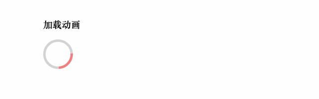
# 加载动画
<style>
.spinner{
  height: 50px;
  width: 50px;
  border-radius: 50%;
  border: 5px solid lightgrey;
  border-left-color: lightcoral; /* 设置左边的边框颜色,也就是在转的那个弧线的颜色 */
  animation: spin 1s linear infinite;
}

@keyframes spin {
  from {
    transform: rotate(0);
  }
  to{
    transform: rotate(360deg);
  }
}
</style>

<section class="box-2">
  <div class="spinner"></div>
</section>
效果: